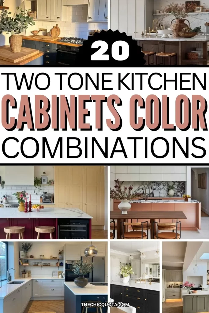
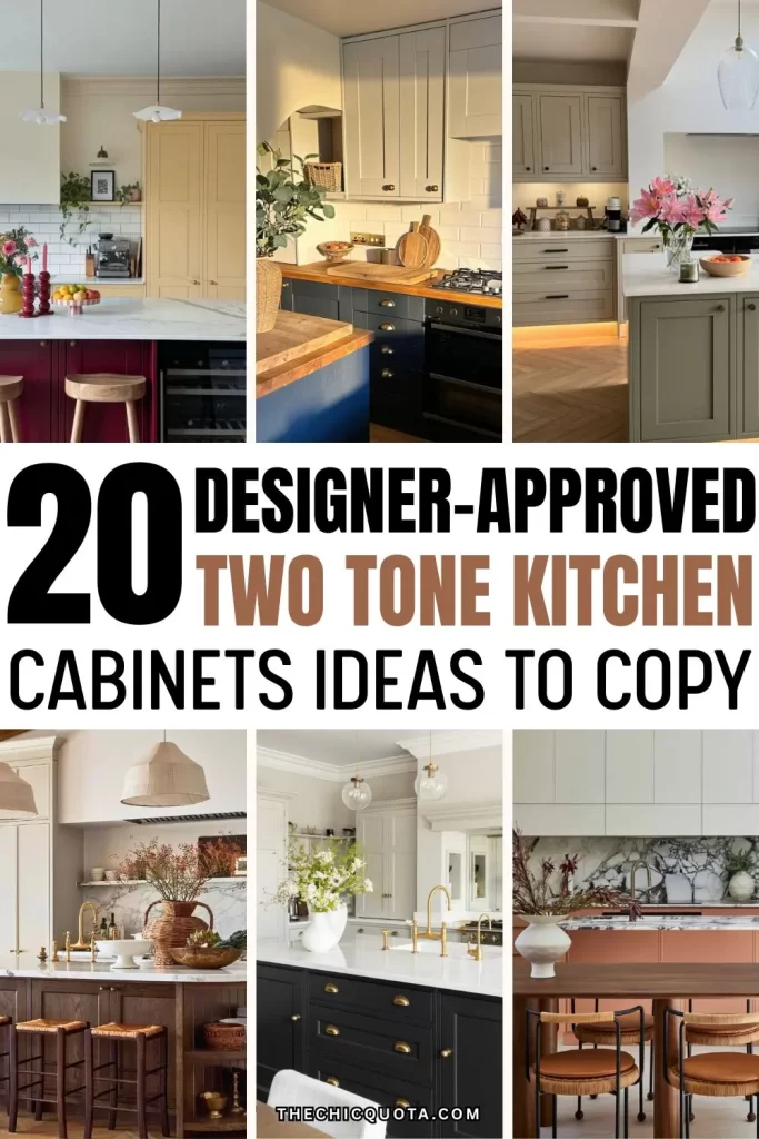
20 Stunning Two Tone Kitchen Cabinets Color Combinations You’ll Love
Disclosure: This post may contain affiliate links. If you choose to make a purchase, I may earn a small commission at no extra cost. I appreciate your support! – Martina
This post is all about the best two tone kitchen cabinets color combinations!
Let’s talk about one of the most popular interior trends of the last few years: two-tone kitchen cabinets.
Whether you love bold colors or neutral tones, this is a fantastic way to add some visual interest to your design and show off your personal style without redoing your kitchen from scratch. Essentially, this approach consists of mixing colors and different materials between your top cabinets, bottom cabinets, and kitchen island.
The best part? It works both in smaller kitchens and larger kitchens – the key is to find the correct color pairings and create the right balance for your space.
So get ready to embrace your creative side, and let’s look at 20 two tone kitchen cabinets color combinations to give you all the inspiration you need! I’m also including some kitchen decor pairings to help you elevate each color set and finalize your design.
20 Must-See Two Tone Kitchen Cabinets Color Combinations
1. White + Navy Blue: A Chic Classic
The classic color combination of white upper cabinets and a deep navy base for contrast is timeless, but contemporary at the same time. This is what you need if you’re looking for a fresh, impactful, and sophisticated kitchen.
Pair with: brass hardware (just like these pulls) and marble countertops for a luxurious touch of elegance.
2. Sage Green + Cream: The New Neutrals
Think of neutral colors with a natural twist. Sage green, one of the trendiest new neutrals of the moment, delivers exactly that. It is soft yet earthy, understated but elevated. Cream then adds warmth, ultimately creating an inviting atmosphere.
Pair with: woven pendant lights and a natural jute rug (love this runner) for a more organic feel.
3. Black + White: Understated Style
This is a striking contrast, you just can’t go wrong with. Black cabinets on the bottom and bright white on top feel modern and elegant. Additionally, unlike a fully black kitchen, this combo will visually extend your walls and open up the space.
Pair with: white quartz counters and clean lines for a sharp, modern look.
4. Olive Green + Taupe: The Perfect Balance
This is. a great mix of organic and modern shades.
The depth of olive green and slightly colder tones of taupe give you a design that’s neither warm nor cool. This is a great option if you want to keep your palette colorful but want the overall impression to be that of a neutral shade.
Pair with: stainless steel appliances and leather island stools (affordable option here) for added contrast.
5. Powder Blue + Cream: Fresh & Effortless
I love how breezy and soft this color combination is.
The delicate nature of powder blue paired with the crisp feel of white upper cabinets offers a lighter shade approach that feels coastal, clean, and colorful without being overwhelming.
Pair with: white subway tiles and wooden open shelves (oversized ones like these are extra chic) for added airiness.
6. Light Gray + Soft Blush: A Feminine Twist
If you love contrast without harsh edges, this is one of the right color combinations for your space.
It’s high-impact and contemporary while feeling feminine and more unique. Overall, a great choice for a chic kitchen that makes a statement!
Pair with: matte black pulls/knobs and light stone countertops for a more modern kitchen.
7. Forest Green + Off-White: Natural Contrast
If you’re into moody tones but feel they are a bit too dark, this is a good color combo for you.
The forest green lower cabinets make the design feel grounded, while the off-white upper cabinets deliver a contrasting color that is light and approachable.
Pair with: herringbone wood flooring for classic charm.
8. Terracotta + Linen White: Desert Warmth
Do you love bold color combinations but are not ready to go full maximalist? Terracotta with linen white is a mix that adds just enough spice and variety without completely abandoning neutrals.
Perfect also for a boho chic space!
Pair with: terracotta tiles and woven textures (baskets are great accessories for kitchen organization) for a similar look to Mediterranean kitchens.
9. Dusty Rose + Light Wood: Cottagecore Charm
I think rose and wood are very delicate complementary colors. They come across as elegant, modern, and minimalist while also being cozy. So pretty!
Pair with: open shelving and antique brass accents for a soft, romantic touch.
10. Peach + Creamy White: Southern Charm
Light and sunny, the peach and white combination delivers warmth and a touch of eclectic design without being overwhelming.
This is a great pick for a small kitchen needing a bright makeover. I also love these shades as they add a touch of 60s and 70s nostalgia!
Pair with: a butcher block kitchen island and gold hardware.
11. Denim Blue + Light Gray: Timeless Shades with a Modern Feel
If you feel like navy and white is too coastal and a bit overdone, this option may be a better choice. Denim blue brings subtle and warm depth, while light gray introduces a gentle contrast that feels both modern and timeless.
This is a color scheme that works for just about any home style.
Pair with: natural wood stools for a relaxed, classic look (these ones are on my current wishlist).
12. Black + Wooden Tones: Modern Organic Design
This combination screams modern and sleek without being too stark or minimalist. It’s not a surprise that it’s such a staple of contemporary kitchen designs.
The pairing of a strong, dark shade with the more organic feel of wood will guarantee an element of visual interest in your kitchen, even if additional decor is kept simple. This is a great example of why well-designed kitchens don’t need a ton of details to feel elevated.
Pair with: sleek integrated lighting and handless drawers.
13. Mustard Yellow + Deep Wood: Elevated Boho Feels
Are you all about organic warmth and cheerful colors? This combo is a bold statement full of personality and flair that will ensure your kitchen remains bright even during the most dull of days.
Pair with: patterned tiles and Moroccan rugs (this one is machine-washable) for an extra Mediterranean touch.
14. Emerald Green + Light Oak: Scandinavian Chic
I am a firm believer that green doesn’t have to scream and that its palette has more to offer than sage.
Emerald green, for instance, is a beautiful, understated shade that pairs perfectly with natural wood. The result is a minimalist and calm combo straight out of a Norwegian forest.
Pair with: white walls and sculptural lighting for understated design elements that let your color palette shine.
15. Mocha Brown + Dove White: Deep Neutrals
Mocha brown on the bottom (especially paired with wooden texture) and white on top create a very elegant contrast. This two-tone design is ideal if you’re drawn to dark colors but still want the softness and brightness of a light shade.
Pair with: brushed gold or bronze chandelier for a luminous focal point.
16. Burnt Orange + Green : Sweet Contrasts
These kitchen cabinet colors remind me of candies; they are so fun! Of course, only opt for something this bold if you don’t think you’ll get tired of it over time. Keeping the surrounding decor and accessories a bit more neutral can also help out.
Pair with: neutral terrazzo counters for a chic, cohesive look.
17. Teal + Pink: A Pop Of Color
Looking for the ultimate pop of color? Teal and pink are bright colors that together pack a good punch. This is one of the more popular color combinations for eclectic kitchens.
These shades are also in between warm and cool, meaning they will look stunning in all sorts of different lighting conditions.
Pair with: copper lighting fixtures for extra warmth.
18. Cobalt Blue + Pale Blue: Coastal Everything
Cobalt and pale blue is a cool, ocean-inspired mix that works very well in smaller kitchens with a lot of natural light.
It’s also a staple for coastal designs that want more color than a beige or white palette.
Pair with: whitewashed floors and rattan chairs (these are perfect if you want an investment piece) for a beachy feel.
19. Burgundy + Butter Yellow: Trendy Shades
Burgundy’s richness plays beautifully with the brightness of butter yellow.
This combination is great if you need to add dimension to your cabinet doors and visually define your kitchen’s layout through strong visual contrast.
Pair with: matte black hardware and natural stone.
20. Blush Pink + Plump: Moody but Light
This combo works beautifully in open layouts where you want color blocking to shine.
I also find it to be a fantastic alternative to a fully burgundy kitchen, something that may be trendy but too moody for a lot of smaller spaces.
Pari with: minimal decor and airy curtains to let the vibrant colors speak for themselves.
FAQs
1. What are the best two tone kitchen cabinets color combinations for my space?
The answer to this question entirely depends on your personal preference and the mood you want to create. If you want to play it safe, classic combinations like navy and white are a popular choice. Organic options like green and oak are also universal favorites since they offer warmth and depth.
2. Should the upper or lower cabinets be darker?
Typically, a darker shade on the bottom and a lighter color up top creates balance and gives the impression of taller ceilings. It’s a great way to add structure without weighing down the room.
3. Are two-tone cabinets trendy or timeless?
Two-toned cabinets are a design trend, especially in recent years. However, with smart color choices, they can feel classic and timeless. It’s all about the type of design you’re trying to achieve.
4. Can I do two-tone cabinets in a small kitchen?
Absolutely! Two-tone cabinets are a dynamic look that can open up a kitchen space, especially when done in light shades or neutral tones.
To Conclude: The Best Two Tone Kitchen Cabinets Color Combinations
This post was all about beautiful two tone kitchen cabinets color combinations!
Whether you’re remodeling from scratch or just repainting, two-tone cabinetry is a powerful way to bring life, contrast, and character to your kitchen.
From white kitchen cabinets to bold contrasts, soft neutrals to accent colors, these combos show that color plays a significant role in defining your space!
This post was all about two tone kitchen cabinet color combinations. Are you looking for more inspiration?
Check out these posts!
- 10 AMAZING KITCHEN COLOR PALETTE IDEAS TO ELEVATE YOUR SPACE
- GREEN KITCHEN CABINETS 101: EVERYTHING YOU NEED TO KNOW BEFORE GOING FOR IT
- BEST 2024 KITCHEN CABINET COLOR IDEAS TO ELEVATE YOUR HOME
- AN EASY GUIDE FOR CHOOSING THE BEST COLOR FOR KITCHEN FLOOR
- AN EASY GUIDE TO THE BEST GRAY KITCHEN CABINETS WALL COLOR IDEAS