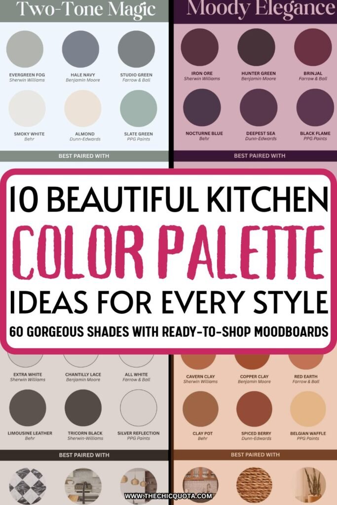
10 Amazing Kitchen Color Palette Ideas To Elevate Your Space
Disclosure: This post contains affiliate links. If you choose to make a purchase, I may earn a small commission at no extra cost. I appreciate your support! – Martina
This post is all about the best kitchen color palette ideas!
Pin It For Later!
If you’re anything like me, choosing the right kitchen color palette feels like an emotional rollercoaster. One minute you’re looking at a gorgeous sage-green kitchen on Pinterest, and the next you’re deep into jaw-dropping blues on Instagram. And this is a big choice. After all, the colors you choose shape the vibe of your kitchen space, and, as I always like to say, interior design is a big vibe game.
Whether you’re dreaming of a green kitchen that feels like a fresh spring morning or a moody palette that can help you bring the drama, it all comes down to choosing and pairing your colors with intention. All you need is not to rush your decision process and a few tips from someone who’s spent way too much time scrolling for inspirational photos and reading up on color theory (hi, that would be me).
So settle in, keep your mind open, and let’s talk through the most stylish, cozy, and on-trend color palette ideas to help you create a beautiful kitchen that feels 100% you!
10 Kitchen Color Palette Ideas You’ll Love
Featured brands for your reference: Sherwin-Williams, Benjamin Moore, Farrow & Ball, Behr, Dunn-Edwards, PPG Paints
1. Warm Neutrals That Feel Like a Hug
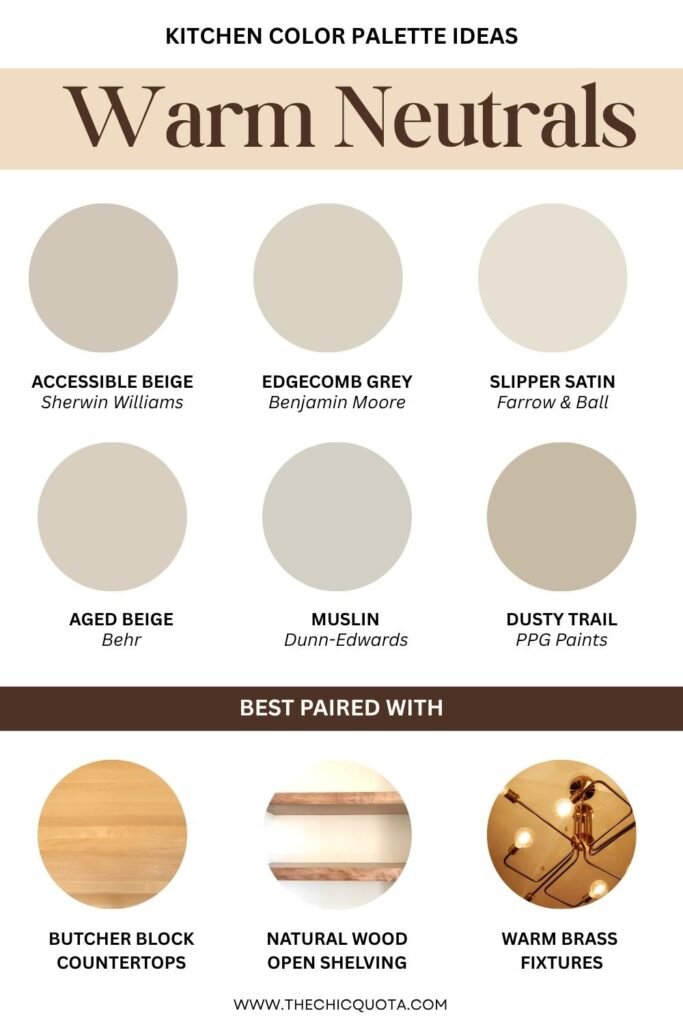
There’s something about warm neutrals that just says, “Come in, stay awhile, and maybe bake a pie.” Think butcher block countertops, creamy warm white walls, and soft beige cabinetry to give your kitchen that cozy-luxe appeal. These shades are understated and classy but by no means basic or boring.
This palette is especially perfect for small spaces—the subtle tones make everything feel open, breezy, and extra comforting while easily reflecting any natural/artificial light.
To spice things up you can also add in a little texture like hardwood floors, rustic shelving, or a ceramic backsplash. Trust me when I say that your kitchen will feel like a Pinterest board come to life.
2. Moody Elegance
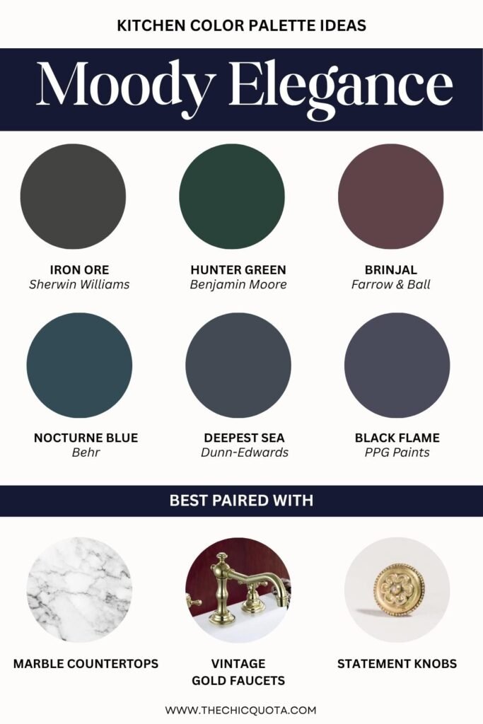
Not afraid of a little drama and true vintage inspiration? I got you. A moody color palette—think deep greens, stormy greys, and even hints of dark blue— will help you create a sultry, elegant energy that just can’t be matched.
You can pair dark kitchen cabinets with marble countertops and sleek gold or brass hardware for a polished finish. Your kitchen will look straight out of an interior decor magazine.
The contrast between the materials and colors will add so much depth and dimension, especially when you balance it with soft lighting and small but elaborate details.
3. Black & White, but Make It Chic
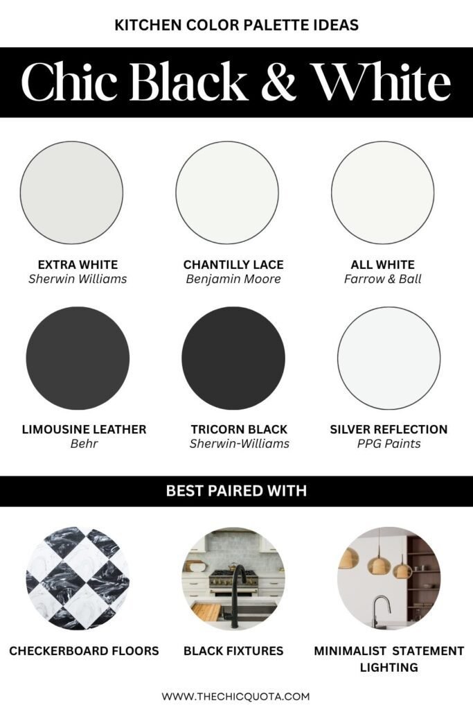
I like to think of classic color combinations like black and white as the little black dress of the design world. The best part? It doesn’t have to be boring! Picture this: black accents on a crisp white kitchen cabinet, paired with matte hardware and a statement checker floor. So chic!
This look can work well in a modern kitchen, where contrast is key. If you want an even more impactful design, you could even add a large window or open shelving to give the whole space an airy, gallery-like vibe. On the other hand, this is a timeless color scheme that can easily be used in more traditional kitchens too.
This is one of the best kitchen color schemes if you want to play it safe but don’t want to compromise on style.
4. Soft Pastels for a Breath of Fresh Air
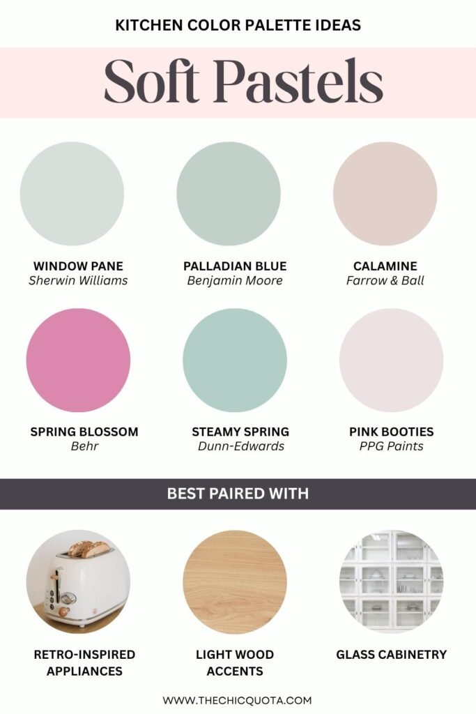
There’s something so refreshing about soft shades like blush, mint, or a dreamy powder blue. When used right, they create a calming, slightly whimsical kitchen that’s anything but childish.
A pastel palette is also a less trendy choice than something like warm neutrals. This will ensure your kitchen feels more unique.
Pastels are perfect for smaller kitchens, especially when paired with lighter countertops and reflective surfaces like glass cabinetry to keep things feeling bright and open. For a cute, inexpensive upgrade, try adding some pastel accent colors also on your backsplash or bar stools. Your space will be full of personality!
5. Greige Everything (Yes, It’s Still a Thing)
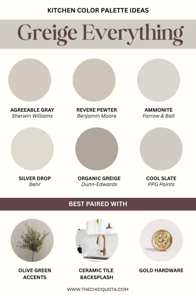
Greige, i.e. the effortlessly chic mix of gray and beige, is still going strong. And honestly? I get it. It’s the ultimate neutral, timeless but contemporary, understated but elegant, and easy to pair. There are so many benefits to a greige palette.
Whether you’re styling a kitchen island or picking out kitchen walls, greige really offers the perfect balance of warmth and sophistication.
Pro tip: try it with olive green lower details or to make your space feel a bit more organic and grounded. Colorful accents are one of those kitchen ideas that can easily make or break a design. They will help you keep your design visually interesting even when going for something a bit more basic.
6. Off-Whites Everywhere
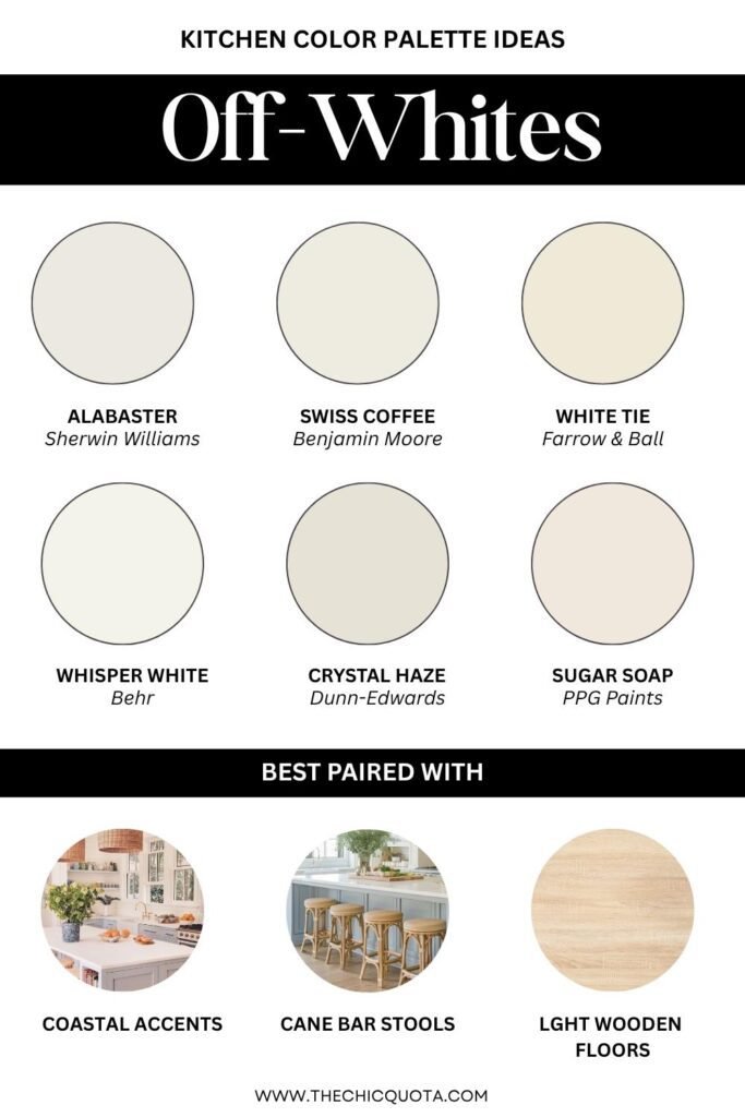
If you’re drawn to a completely neutral scheme but don’t want the starkness of pure white, off-whites are the way to go. This term includes all white shades that are a bit more subtle and creamy (warm undertones) or silvery (grey undertones).
An off-white palette is the ultimate way to visually open up your space and create a sophisticated backdrop that lets furniture and decor shine. This is because this color scheme is incredibly flexible!
By using it as your base color and mixing in different shades through tile, textiles, or wood tones you will end up with a beautifully layered design. This look is ideal for modern spaces where the goal is an effortless, curated finish.
7. Earthy Desert Tones
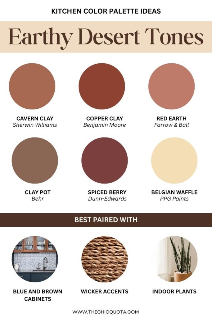
Depending on how long you’ve been passionate about interior design, earthy shades can remind you of two styles. If you’ve witnessed the magic of 2010s decor, then you’ll think of boho spaces. If you’ve stumbled upon these palettes in more recent times, you’ll think instead of Mediterranean, organic interiors.
Regardless, terracotta, clay, and sandstone are warm, sun-drenched hues inspired by the natural world. These kitchen colors are perfect if you’re craving something grounded, warm, and earthy.
You can pair terracotta tiles with white cabinets or layer with wicker or gold accents for a chic Southwest vibe. Of course, they look especially stunning next to greenery, so bring on those plants.
8. Playful Pops of Color
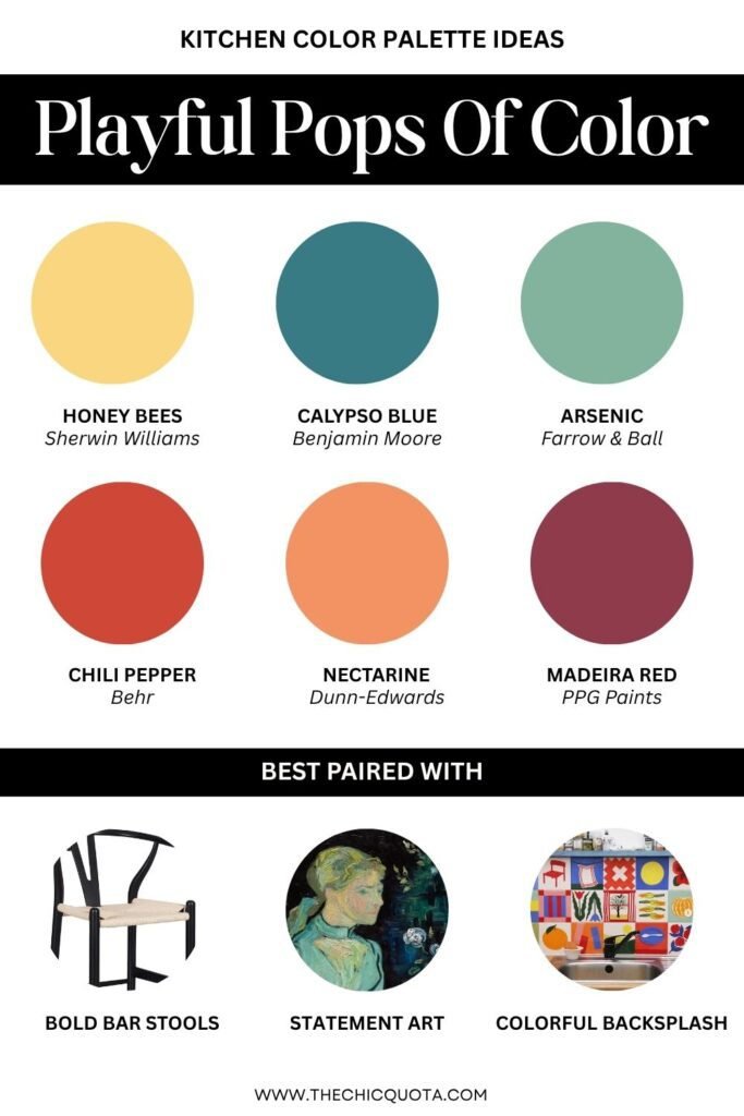
Color lovers, this one’s for you. If you want your kitchen to be as bold and eclectic, playful pops of colors are where it’s at. A deep red dining table, yellow bar stools, or blue cabinets will add plenty of energy and dimension to your space.
Of course, be mindful of using bright colors in moderation.
They’re best when balanced with neutral walls or more muted surrounding features. This keeps things feeling interesting instead of chaotic, especially in a small kitchen where every visual inch counts.
9. Two-Tone Magic
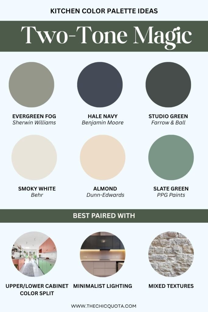
Can’t decide between two colors? Do both. Two-tone kitchens are having a serious moment and have become one of the most popular kitchen trends for good reason.
You can try to have lower cabinets in a bold shade (hello, forest green) and upper cabinets in something softer like warm gray or cream. You could also complement navy kitchen cabinet colors with a contrasting wood kitchen island.
The right color scheme doesn’t need to be super complex or include many different shades. Sometimes keeping it simple is the way to go!
10. High-Contrast Neutrals
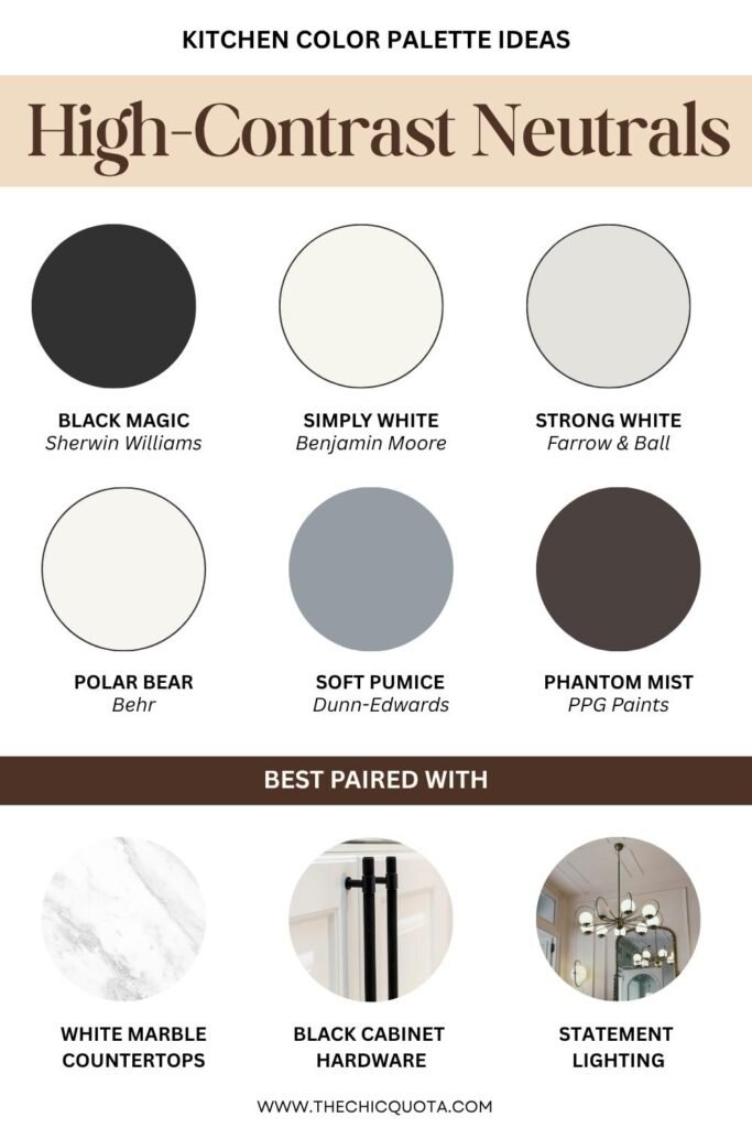
If you love a sharp, polished look, high-contrast neutrals are your best friend. Think black cabinets paired with crisp white walls and edgy black paints mixed with grey accents for extra depth.
This look is especially stunning in a large kitchen, where you have room to play with visual weight.
You can also add brass accents and stone finishes for a more vintage and rich, layered look. Black matte hardware or minimalist lighting can help you instead create a more modern look.
Kitchen Color Palette Ideas – FAQs
What is the best color for a kitchen?
The best kitchen color scheme entirely depends on your taste and lifestyle. Remember, your spaces need to speak of you and your style while remaining functional.
However, if you’re looking for the most flexible shades, you’ll want something like sage greens, warm neutrals, and soft whites. Use the color wheel to guide your combos starting from these basic shades and keep balance in mind.
Should my kitchen cabinets be lighter or darker than my walls?
The answer to this question depends on your layout. In smaller kitchens, lighter cabinets can help open the space, while darker cabinets can add depth to a larger kitchen. It’s all about proportion, contrast, and your personal design choices.
What color kitchen is timeless?
For a timeless kitchen idea, you’ll want to stick with neutral bases. Think of soft whites, warm grays, or gentle greens, and pair them with classic color combinations.
You can always add more trends and personality through hardware or backsplashes so you can easily refresh things later if you want.
To Conclude
This post was all about the best kitchen color palette ideas!
At the later stage of any renovation, choosing the perfect color can feel overwhelming. But trust your instincts—and maybe that saved folder of kitchen makeover pins.
Start with a vision, think about your home’s light, mood, and flow, and don’t be afraid to explore different colors and finishes. Whether you go full bold color or lean into neutral colors, the right palette brings your cooking space to life.
If you’re unsure where to start, swatch your top kitchen paint ideas, look at them in every light, and trust your gut. The perfect paint color is the one that makes you smile every time you walk in.
This post was all about kitchen color palette ideas. Are you looking for more inspiration?
Check out these posts!
- GREEN KITCHEN CABINETS 101: EVERYTHING YOU NEED TO KNOW BEFORE GOING FOR IT
- BEST 2024 KITCHEN CABINET COLOR IDEAS TO ELEVATE YOUR HOME
- AN EASY GUIDE FOR CHOOSING THE BEST COLOR FOR KITCHEN FLOOR
- 21 IDEAS FOR THE BEST BATHROOM COLOR SCHEMES YOU’LL LOVE
- 20 STUNNING TWO TONE KITCHEN CABINETS COLOR COMBINATIONS YOU’LL LOVE
- AN EASY GUIDE TO THE BEST GRAY KITCHEN CABINETS WALL COLOR IDEAS